Travelex Money Card app
A mobile app redesign focussed on improving feature discoverability, resolving usability issues and simplifying core purchase journeys to reduce friction and drive repeat usage.
Overview
The previous Travelex app was difficult to navigate and suffered from multiple usability issues, with customers struggling to complete essential tasks like viewing balances, finding transactions and topping up their card. On the technical side, the codebase was hard to maintain and not well-suited for white-labeling, a crucial part of Travelex’s partner-driven business model. The challenge was to design a new app to address these usability and technical issues while improving the core user journeys and continuing to identify opportunities to create a more compelling app experience that would attract new customers and encourage repeat use among existing ones.
My role
I partnered with another designer during the initial phase of the app redesign, then led the later stages and have continued to own the design, driving iterative improvements based on customer feedback from user testing and by analysing usage data. I collaborate closely with product managers, developers and various cross-functional stakeholders throughout, while testing with real users to ensure the experience meet both user needs and business goals. I also contribute to building and maintaining a global design system, including tokenisation to support efficient white-labeling of partner apps and websites.
Key outcomes
- •10% year-on-year increase in customer conversion rates.
- •Increased average top-up value and frequency per customer.
- •Measured improvements in usability and accessibility.
- •Boosted app store ratings and customer reviews.
- •Improved error handling, resulting in a reduction of support centre contacts.
- •Successfully launched a white-labeled version for Asda, with a new major partner release underway.
The previous Travelex app was difficult to navigate and suffered from multiple usability issues.
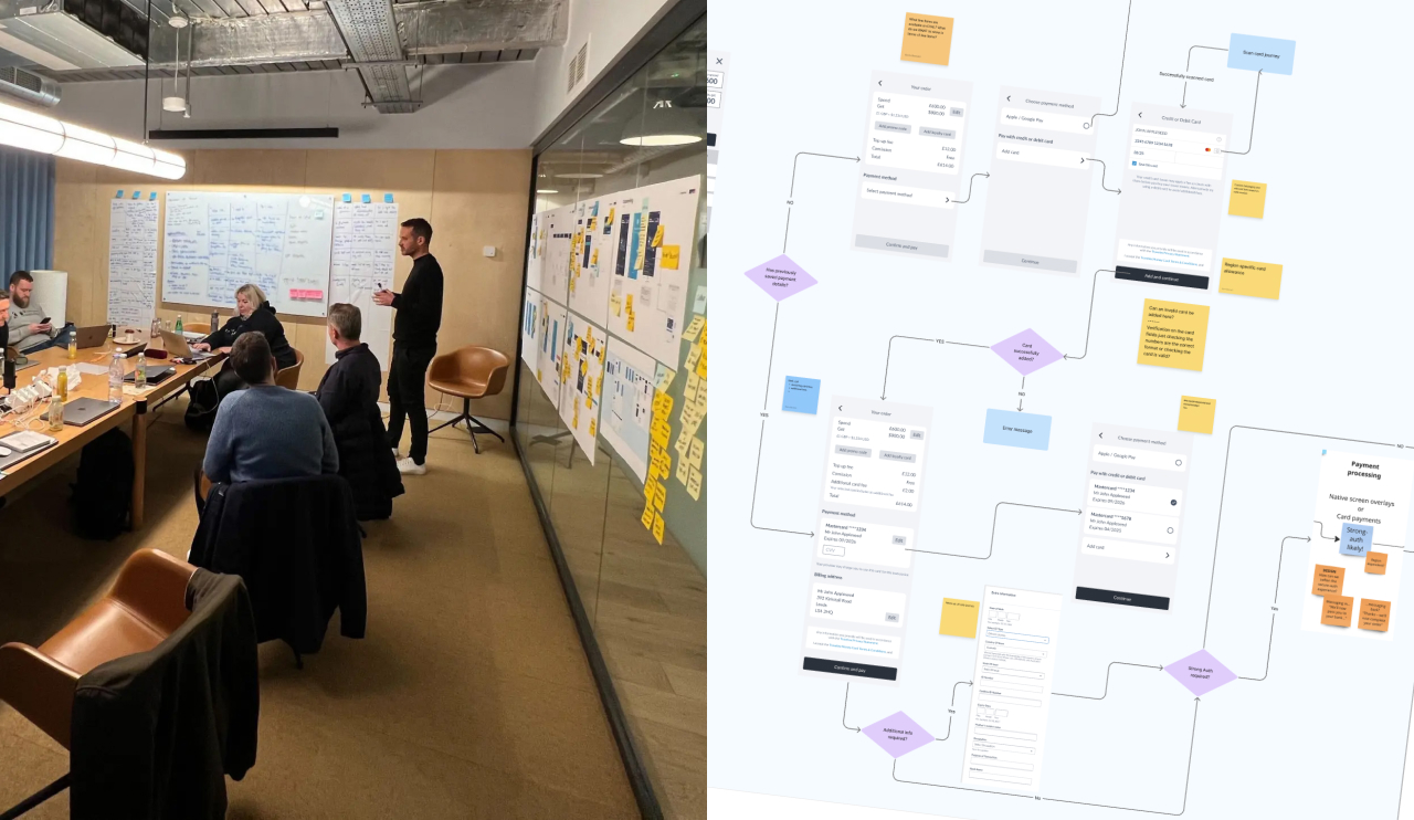
I collaborate closely with product managers, developers and cross-functional stakeholders during all stages of the design process.
Prototypes created with Figma were used to test and get feedback from real users.
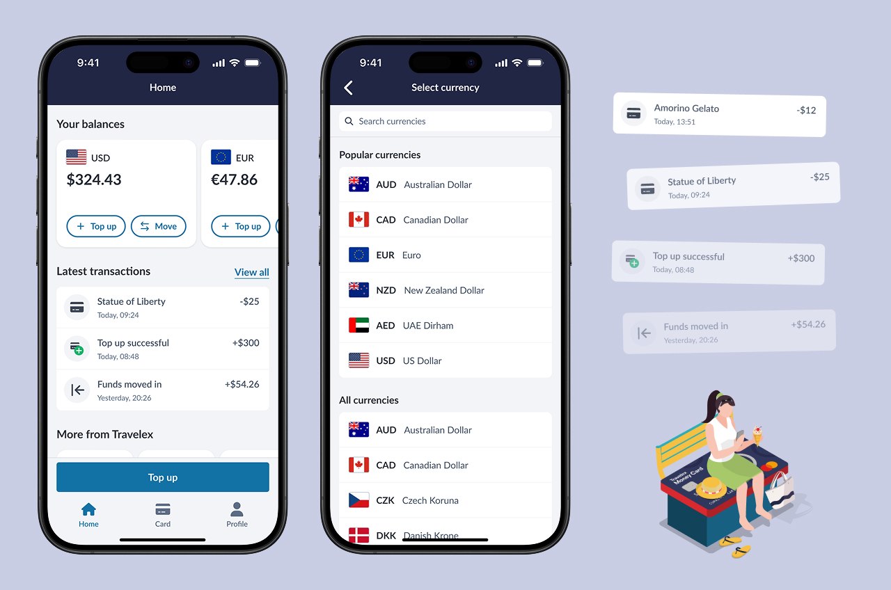
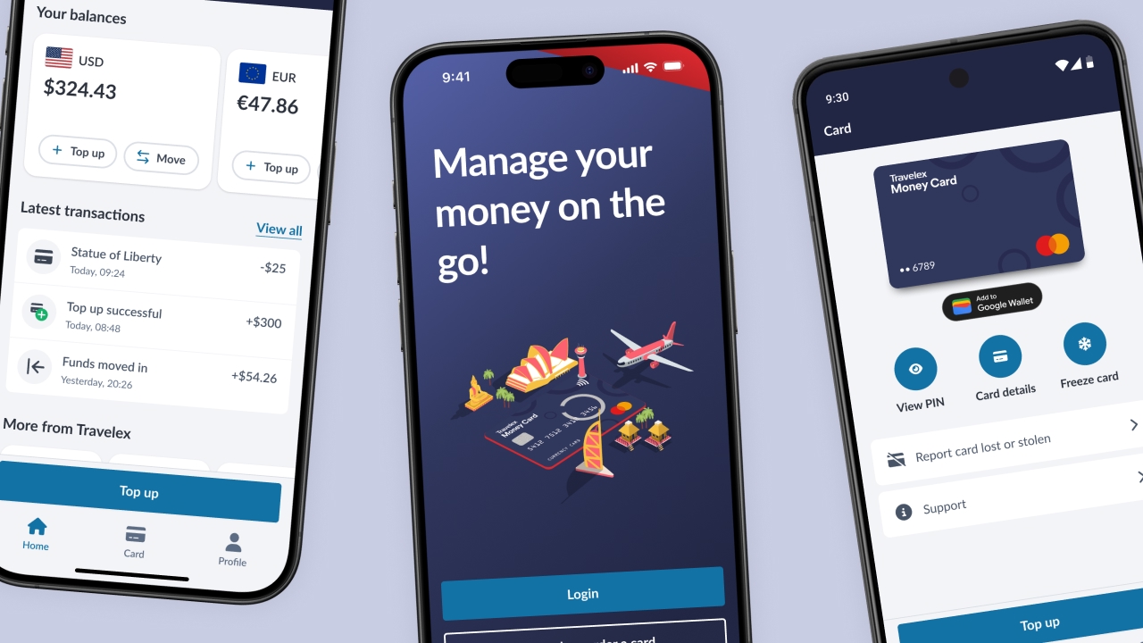
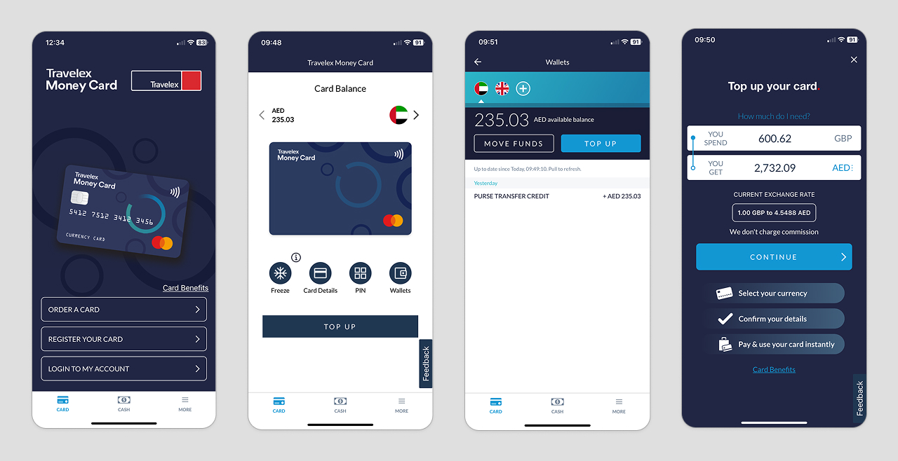
The updated design of the app ensures the most important functionality for users is front and centre.
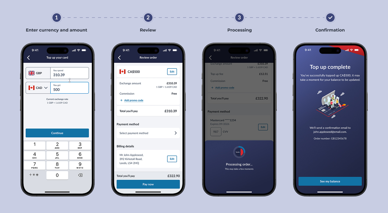
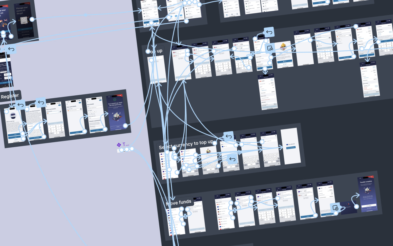
Iterative improvements have been made to the core app flows based on user feedback and usage stats.
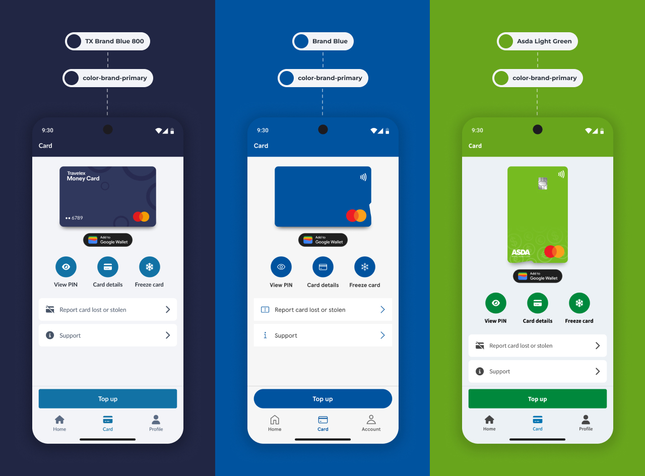
Tokenisation has been implemented to easily allow brands such as Asda and another upcoming partner to customise colours, fonts, border radius, icons and more.
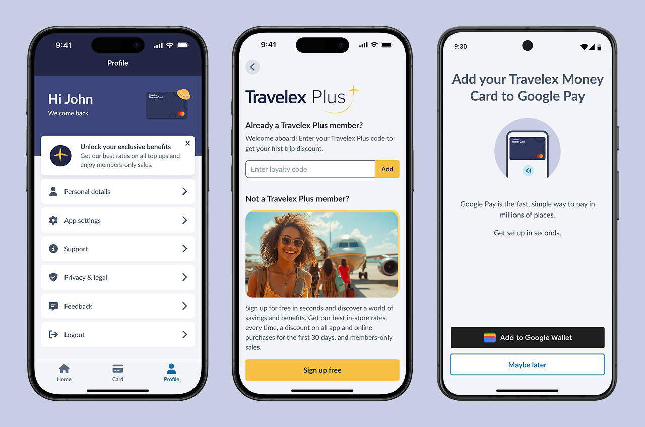
A/B experiments have been run to measure and improve key metrics such as Travelex Plus sign ups and digital wallet adoption.