BT Sport iOS and Android apps
As more customers were starting to use the mobile and tablet apps as their main way of accessing BT Sport content, it was important to keep improving the app to ensure they were getting the best experience and values.
Initial redesign
I was tasked with redesigning the existing BT Sport apps on iOS and Android in order to make a number of design improvements along with introducing a brand update.
Usage stats and user feedback also highlighted that news article engagement was low which influenced the decision to make the new design more focused around discovering and viewing video content.
Simplifying the app structure
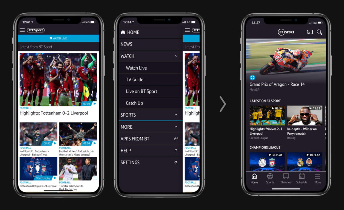
Recurring user feedback highlighted the existing app was confusing to navigate due to the bloated side menu that included links to duplicate content and unused features. I spent a lot of time analysing the old app and how users were using it in order to help find a more efficient and logical way of structuring the updated app, as well as identifying any unused features to remove.
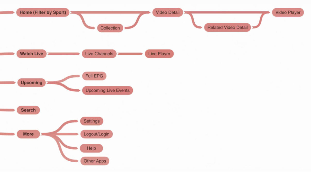
Bottom tab bar navigation
I moved the main navigation into a bottom tab bar for a more streamlined way of navigating the app and making users current location within the app clearer. Also by always being visible the tab bar would aid in the discoverability of new content they may be interested in.
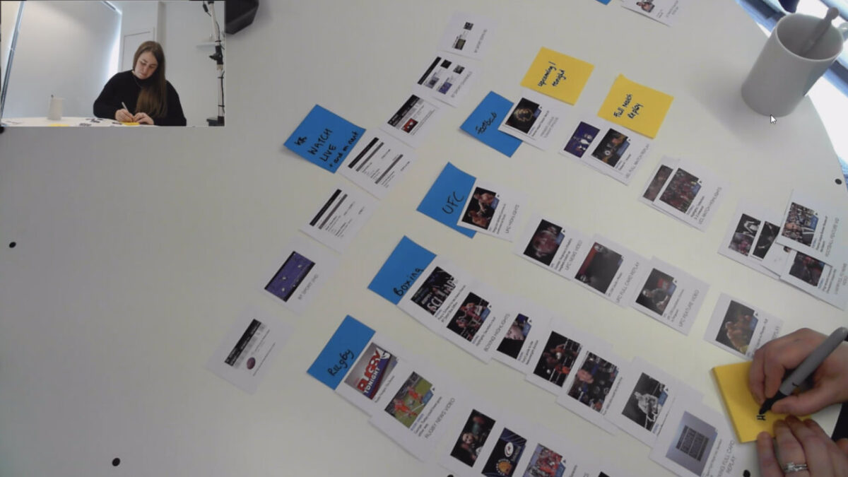
Getting feedback from users
Speaking with users and getting feedback on prototypes over several rounds of testing was crucial in helping to shape the design, making sure it was user friendly and catered to their needs.
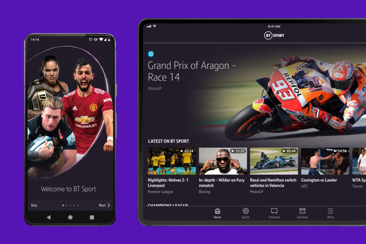
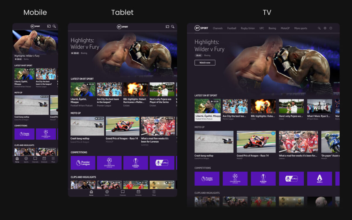
Keeping consistency across all platforms and screen sizes
I created a carousel based design that would translate across multiple platforms and screen sizes while staying faithful to the design guidelines and user expectations of each device. This gives users a consistent experience across all their devices and allows the content editors to update content on all platforms at the same time.
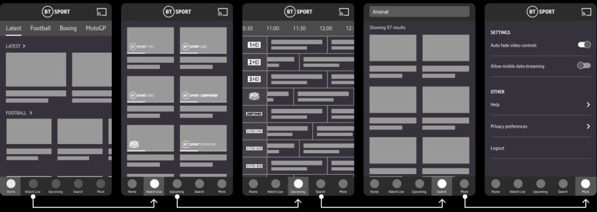
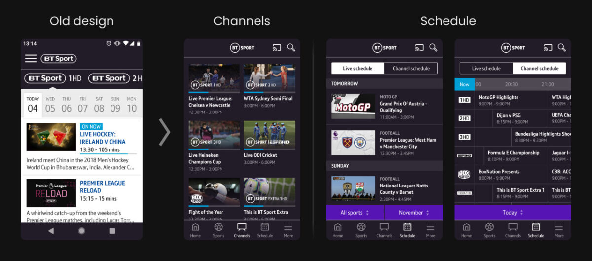
Seeing what’s on the BT Sport channels
In the old app users struggled to navigate through the different channels and programming schedule due to the clunky interface where they had to navigate through each individual channel separately.
In the new design I separated the channels and schedule into two sections, with the channels section giving users the ability to quickly see what’s currently on across all channels and the schedule section showing a list of all upcoming live events along with a full programming guide with filtering options.
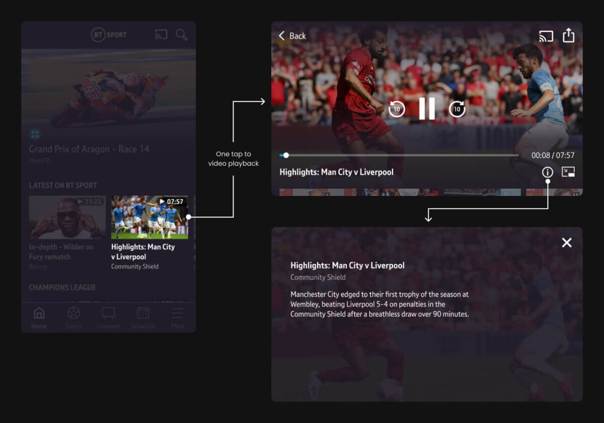
Improving the video playback experience
In order to make the experience of watching video content as seamless as possible, I removed the video detail screens so users can start watching as soon as they tap on a thumbnail while now allowing users to access info such as the synopsis and sharing options from inside the player.
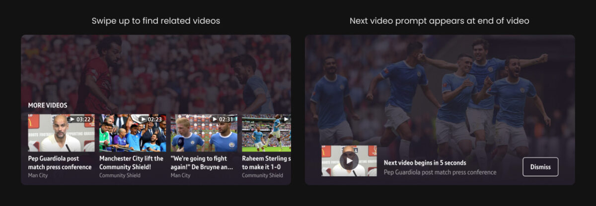
Increasing video engagement
I also explored ways of making it easier for users to find other videos without leaving the video player. A carousel containing related or similar videos that can be accessed by swiping up was added along with a prompt appearing at the end of a video with a related video suggestion.
Both of these solutions led to an increase in a number of metrics such as average visit duration, average number of video views and average time spent watching video content.
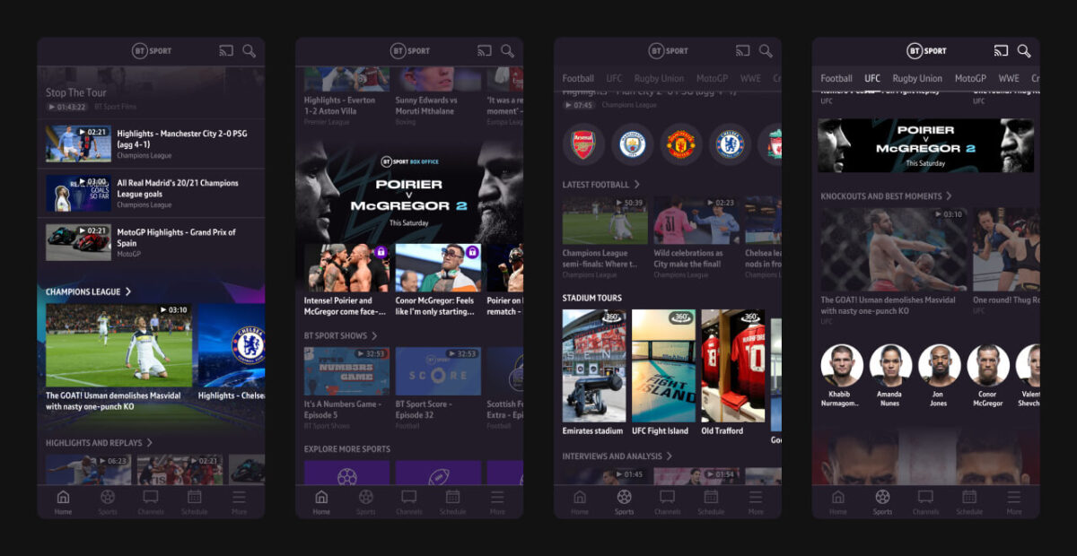
Making it easier to highlight content
The content editorial team highlighted a need for more methods of presenting content within the app to help give prominence to certain content and help create a stronger visual hierarchy.
Taking this feedback onboard I designed new content blocks the editors could customise and rearrange in any order, with the added goal of making the app feel more dynamic and easier to digest which had been highlighted by users as an issue.
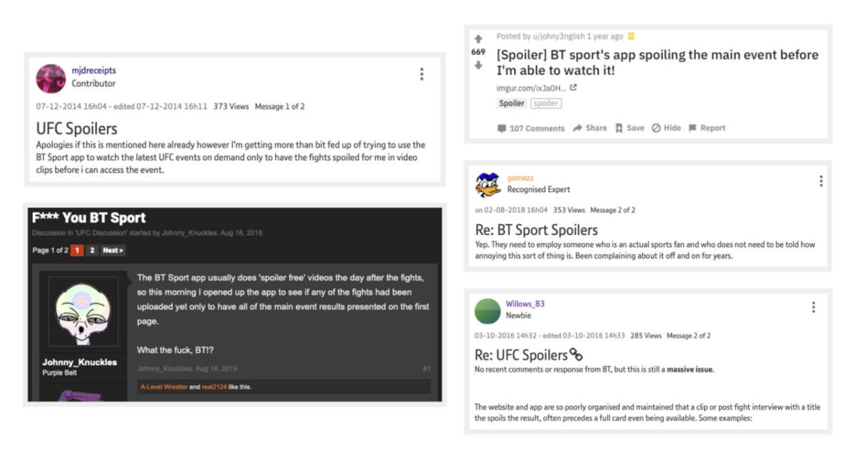
Removing spoilers
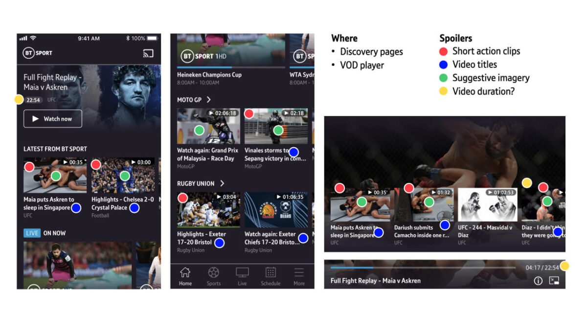
Fans of UFC and boxing often complained about seeing spoilers in the app before they had a chance to watch the replay of an event that took place late at night or early morning.
After discussing the problem with the developers and content editors it was clear that implementing a full “spoiler free mode” within the app would require the need to hide scores in titles, update imagery and hide short action clips which would be too technically complex for what was a problem for a relatively small group of users.
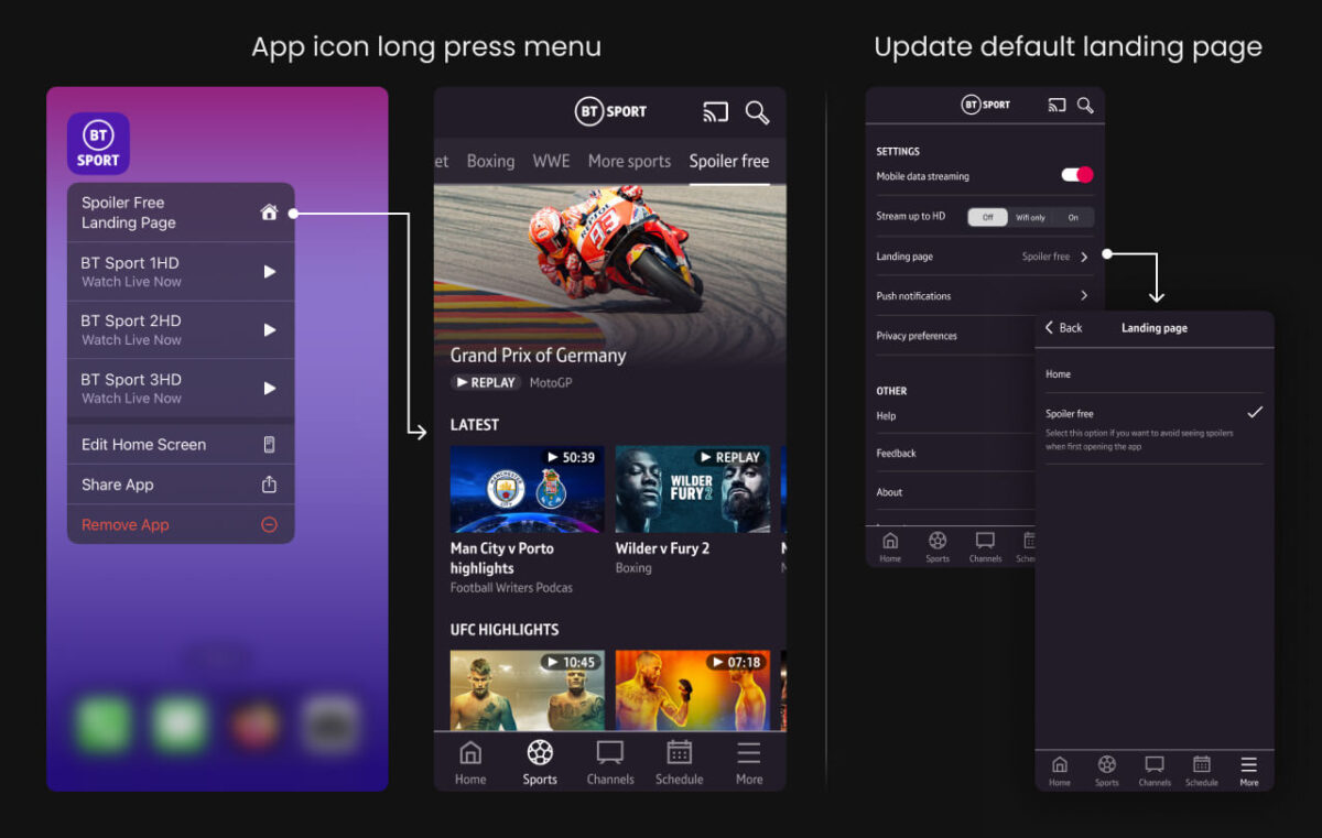
Spoiler free landing page
I designed a simple solution that enabled affected users to update their app settings so they would be directed to a newly created spoiler free page whenever they open the app, where they can find full replays of recent events without the risk of stumbling upon any spoilers.
Users can also access the spoiler free page without changing their settings by tapping on the spoiler free link in the app icon menu which can be accessed by long pressing on the app icon on both iOS and Android.
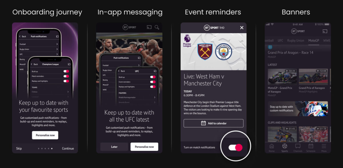
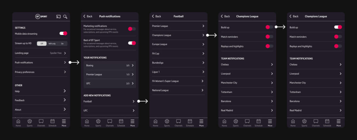
Personalised push notifications
User feedback highlighted the desire for a more personalised experience, and push notifications was seen as a way of notifying users about content they’re interested in but may have missed. They were particularly successful at increasing app engagement during days where no large live events were taking place which also helped increase user retention
I designed the experience for how to set up and manage push notifications, working closely with the development and editorial teams to define the level of customisation we were able to offer to users, which was updated over time based on usage stats.
Increasing push notification adoption
A prompt to sign up for push notifications was added to the onboarding journey, however users would only see this on the first open after downloading the app so users who already have the app on their device wouldn’t see this. Also a large amount of users opted to skip the onboarding journey before reaching this step.
Therefore I explored alternative ways of notifying users about push notifications in order to increase adoption, such as in-app messaging and banners that could be targeted to certain users based on preferred sports and viewing habits.