BT Sport live timeline and goal alerts
The main usage of the BT Sport apps for the majority of customers revolves around watching live content, therefore a lot of time was spent looking for ways to improve the live experience across all platforms.
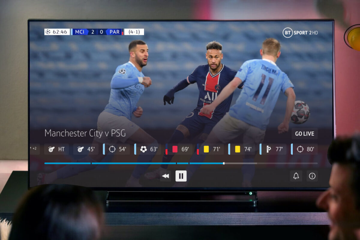
The live event timeline and goal alert features in the mobile and tablet apps were always praised when speaking with customers and the usage stats highlighted they were used by over 60% of users who watched live content, so I was tasked with designing the equivalent experience for the large screen platforms such as Samsung TV, Apple TV, PlayStation, Xbox, Amazon Fire and Roku.
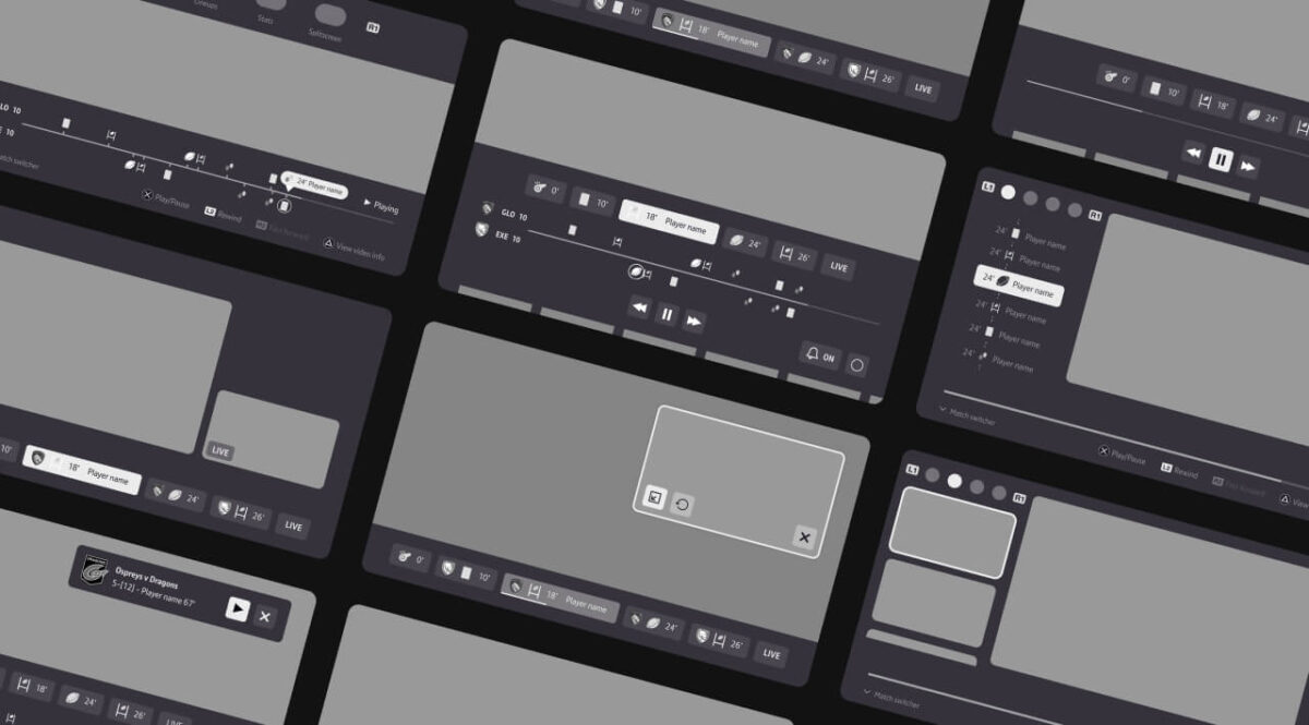
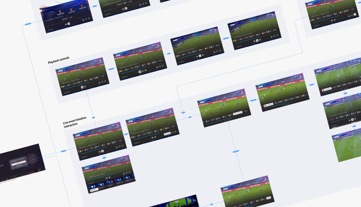
Early concepts and wireframes
I explored many different design options, from complex visual timelines to simpler designs requiring only horizontal input to navigate. There was also a lot of thought that went into the best way to playback the event replay when a timeline button or goal alert is pressed.
Getting feedback from users
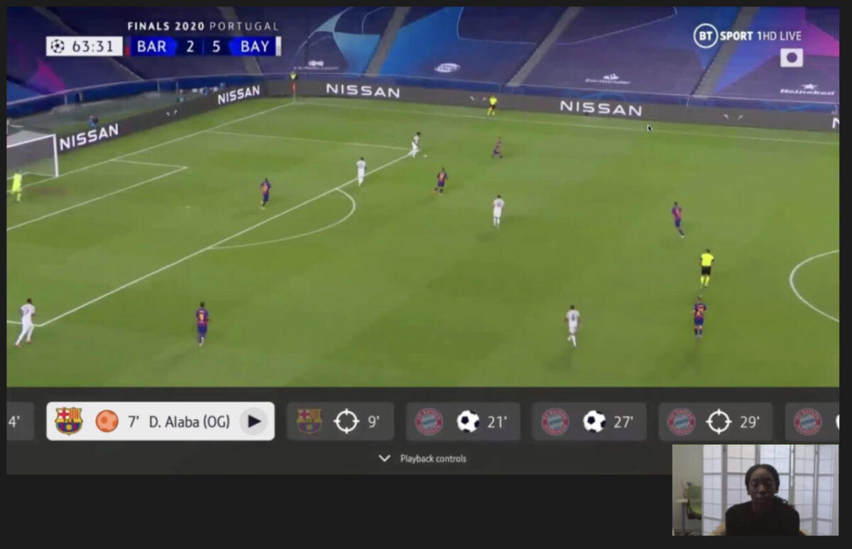
I worked closely with a user researcher to conduct several rounds of usability testing, getting feedback on early concepts to more refined prototypes I had created using Unity and ensuring all iconography was clearly legible and understandable.
Designing for directional buttons
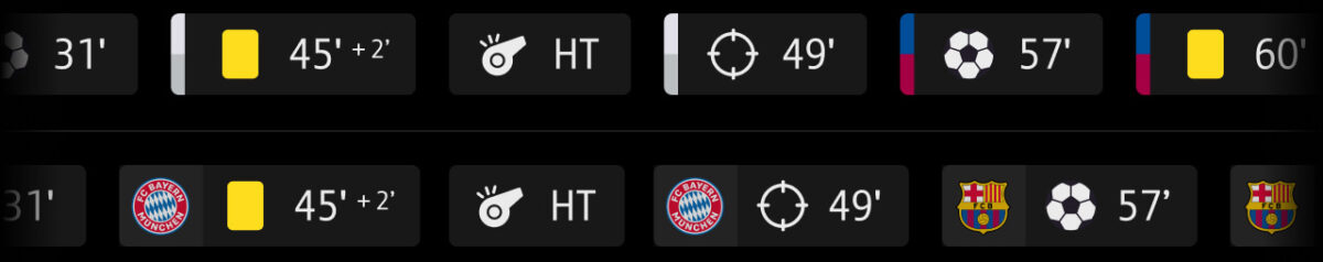
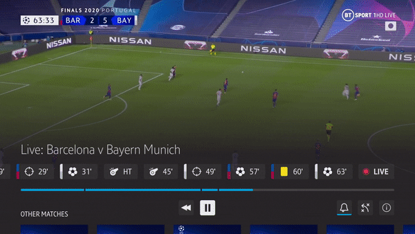
It was clear early on that the complicated visual timelines were confusing to understand and difficult to navigate using the directional buttons on controllers, whereas the simpler horizontal timeline was much easier to navigate.
Team colours vs team badges
Using team badges to signify which team the timeline event belonged to added visual complexity making it hard to understand compared to using the colour of the teams kit, which is also consistent with the score graphics found in most event broadcasts.
Expandable buttons
The timeline buttons only show the most important information such as the team colour, icon and timestamp. The button expands to reveal additional information such as the players name if the user has focussed on the button for longer than a second.
Adaptive interface
Customer feedback indicated there was too much visual noise and confusion with the early prototypes that showed all buttons and information on screen, so I updated the designs to hide unrelated interface elements while interacting with the timeline or match switcher, allowing the user to focus on their current task.
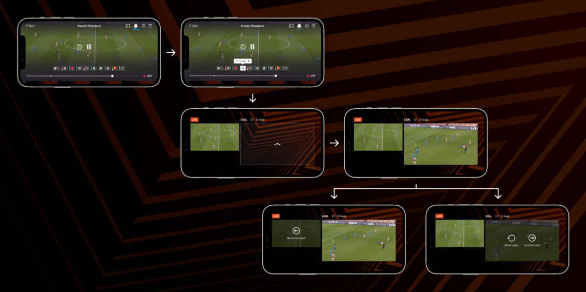
Playback of key events and goal alert replays
There were three main design options I explored for how to playback the replays:
- Rewind the stream back to when the event took place.
- The replay appears in a small picture-in-picture above the live stream.
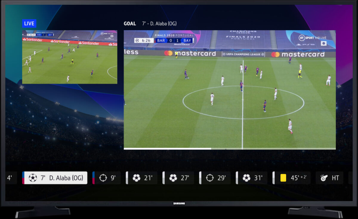
- Show the replay side-by-side with the live stream.
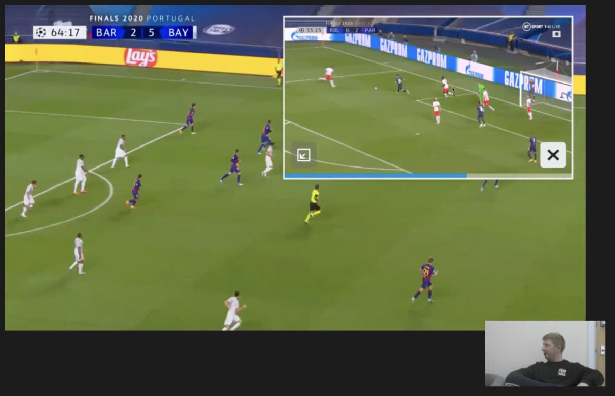
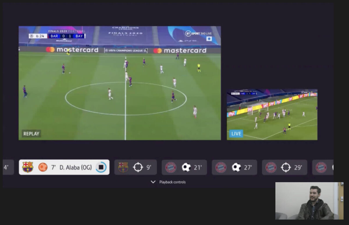
The side-by-side design was preferred by users as it allows them to seamlessly watch a large replay while still being able to keep an eye on what’s happening in the live event without obstruction, users then return to live stream automatically once the replay has concluded. However not all platforms are able to play two live streams concurrently so those platforms would use the first option of rewinding the live stream to when the event takes place.
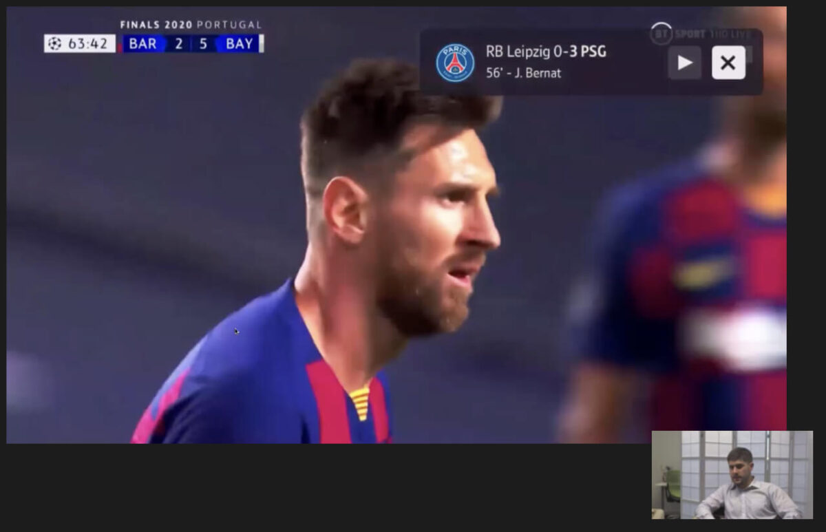
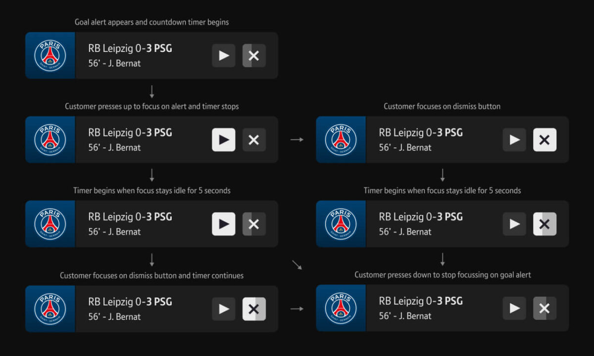
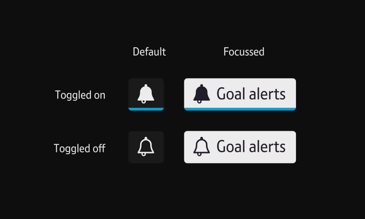
Ensuring the goal alerts don’t become an annoyance
I came up with a visually simple design that matches the rest of the UI and also disappears automatically after a certain amount of time but can also be manually dismissed easily.
I also added a button that would allow users to toggle the goal alerts on and off. I also explored customisation options such as filtering by team or competition but this felt overly complicated when tested with customers.
Updating the event timeline on mobile and tablet
Based on the positive feedback from customers and the useful findings from user testing, I also updated the timeline and goal alert features for the iOS and Android apps, improving the experience and creating consistency between all platforms while optimising for touch input.